Progress circles are a classic dashboard element. They provide stats in a quick to digest view. There are several ways to go about implementing one. You can either use javascript and render it in canvas, hack it together in CSS, use an image, or use SVG's.
View The Demo
Making a progress circle in SVG isn't as hard as you might imagine. Let's start with the basics:
1 - Create the backdrop circle
Here, we create a basic shape that's got a radius of 90px. The cx and cy values allow us to center the circle inside the SVG element. These are the points at which we want the center of the circle to be (so half of the width/height of the SVG element).
We've also added a few stylistic properties such as giving it a 3px grey stroke.
<svg width="240" height="240" xmlns="http://www.w3.org/2000/svg">
  <circle r="90" cy="120" cx="120" stroke-width="3" stroke="#333" fill="none" />
</svg>

2 - Add the progress circle
The circle that we just created will act as a backdrop to our actual progress circle. Let's make that now:
<svg width="240" height="240" xmlns="http://www.w3.org/2000/svg">
  <circle
    id="backdrop"
    r="90"
    cy="120"
    cx="120"
    stroke-width="3"
    stroke="#333"
    fill="none"
  />
  <circle
    id="progress"
    r="90"
    cy="120"
    cx="120"
    stroke-width="4"
    stroke="red"
    fill="none"
  />
</svg>
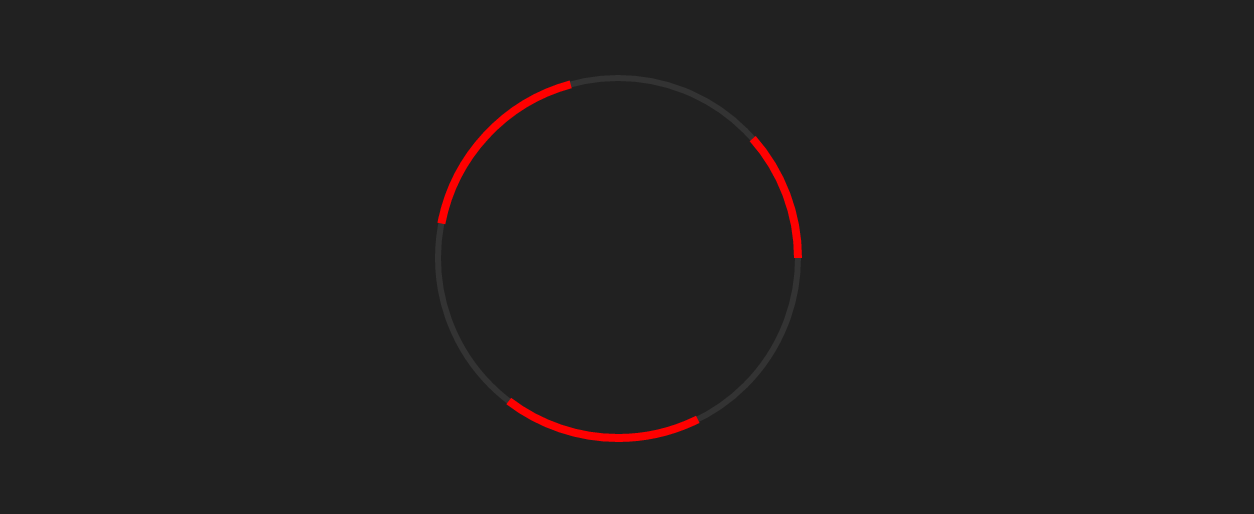
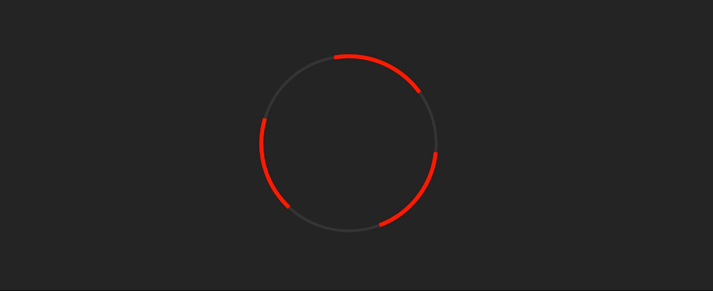
We now have two circles sitting on top of each other. However a full red circle would represent 100%. So how do we make the circle only show for a given percentage?
3 - stroke-dasharray and stroke-dashoffset
Now we need to jump into the CSS. SVG provides us with two properties called stroke-dasharray and stroke-dashoffset that we can use to add a dashed effect to our circle. Setting both properties to 100 will give us the following:
#progress {
  stroke-dasharray: 100px;
  stroke-dashoffset: 100px;
}
We can then add a simple keyframes animation to change this value:
#progress {
  stroke-dasharray: 100px;
  stroke-dashoffset: 100px;
  animation: progressAnimation 600ms linear infinite;
}

@keyframes progressAnimation {
  from {
    stroke-dashoffset: 100px;
  }
  to {
    stroke-dashoffset: 300px;
  }
}
4 - Working out what stroke-dashoffset to set
Now that the effect has been demonstrated, it's now a case of working out how a given percentage maps to the stroke-dashoffset value. Quick warning, this requires a basic understanding of maths!
Here we're going to do this in Sass, however it's certainly possible to do this on the client in JavaScript and the CSSOM (although watch out for floating points).
$radius: 90;
$percent: 83;

$circumference: (pi() * (2 * $radius));
$stroke_percentage: $circumference - (($percent / 100) * $circumference);

#progress {
  stroke-dasharray: $circumference;
  stroke-dashoffset: $circumference;
}

#progress {
  animation: progressAnimation 1600ms linear 500ms forwards;
  transition: stroke-dasharray 400ms linear;
}

@keyframes progressAnimation {
  to {
    stroke-dashoffset: $stroke_percentage;
  }
}
First, we set some basic variables such as $radius (which is the radius of the circle), $percent (the actual percentage we want the circle to show), and the $circumference of the circle.
From this, we can work out what the stroke-dashoffset value should be by subtracting a proportional length from the circumference.
However if you try this, you might find that the graph is slightly off. The stroke dash starts at 3 o'clock on the circle, so to counteract this, we need to rotate the entire SVG 90deg counter-clockwise.
And you're done!
I've added a slightly more pimped version up on CodePen, which also has some further docs about the maths in the code. If you have any questions regarding this, or if it doesn't work, feel free to leave a comment below!
Update: Just out of interest, I have also added a JS version here.